
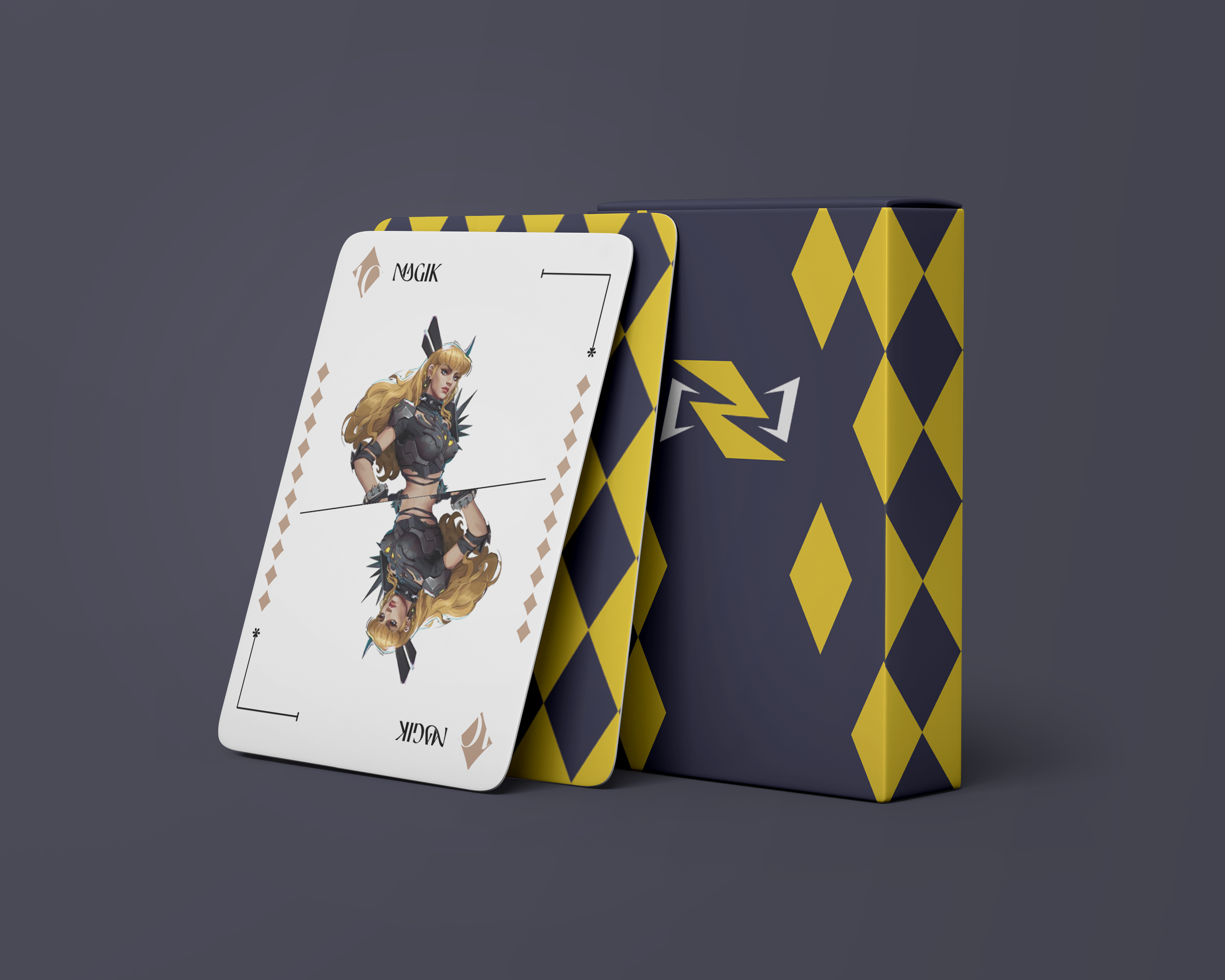
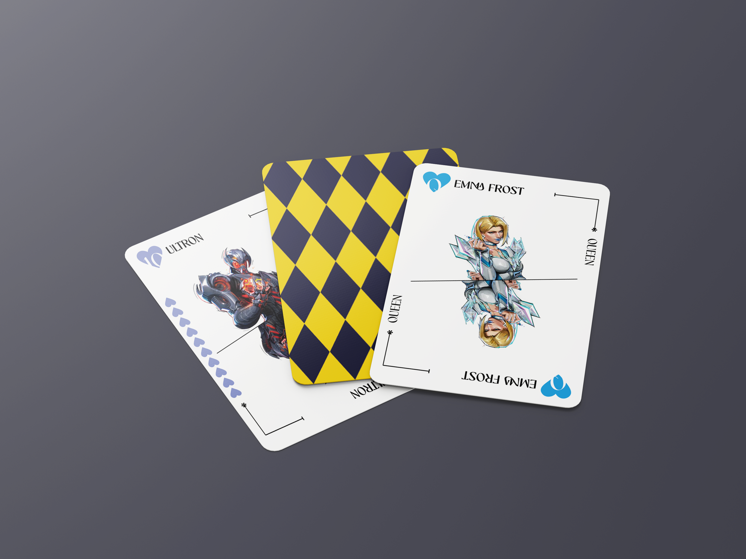
Marvel Rivals
Playing cards
This is a project i did for fun to fill some time in while i waited for our exam to be evaluated
-
This project was something i did for fun. Originally i was going to only make a set of Hearts but after encouragement from my good friend Jayse i decided to make a whole set of 44 cards + a box
-
Playing cards have always been something i think are an avenue for some great creativeness. Turning every card into a face card allows me to make a unique design and show off all 44 (45 as of writing this) members of the cast of Marvel Rivals.
I also made the cards mirrored so there really is no definite up or down and can be used for whatever and however you’d want
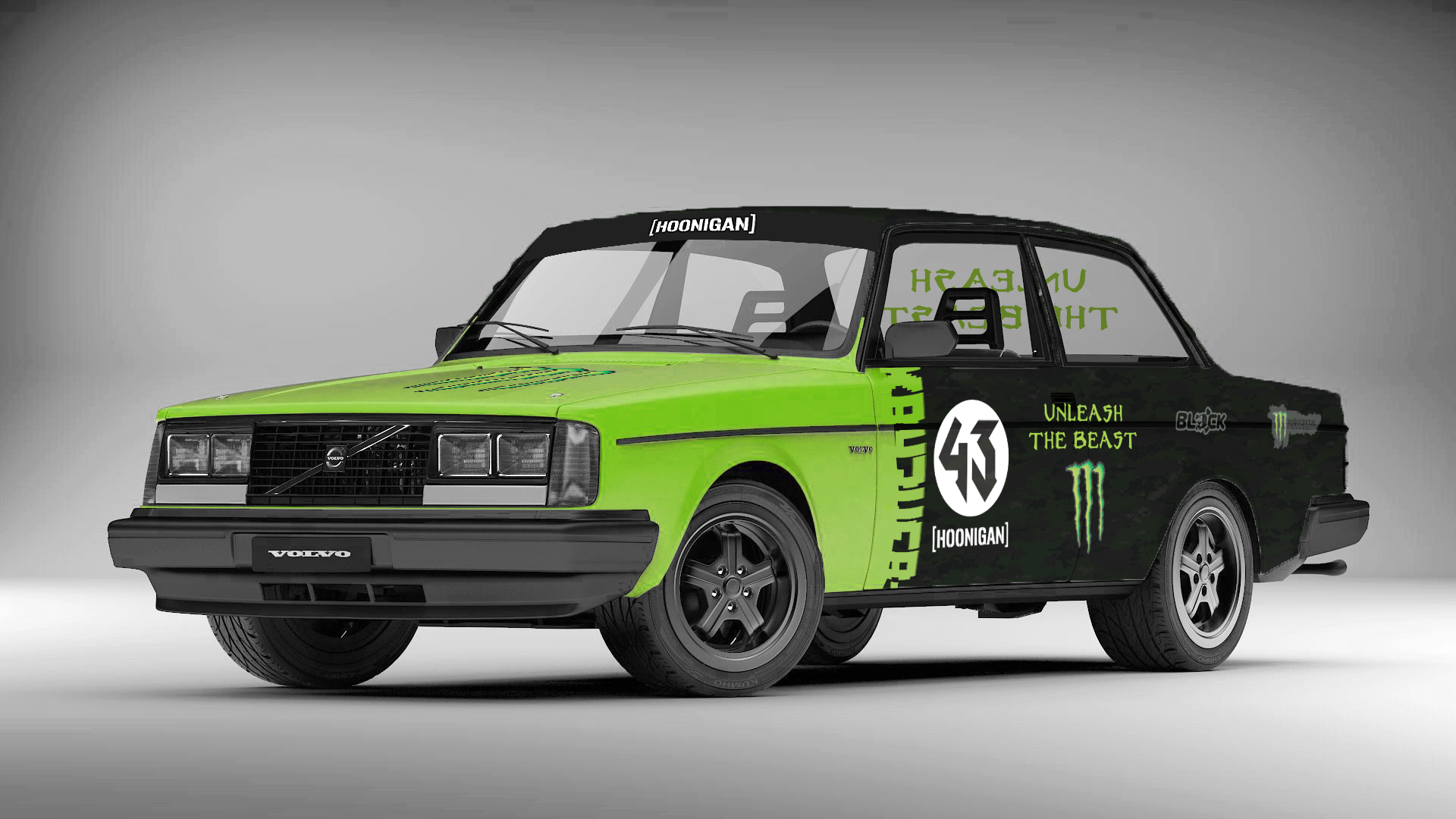
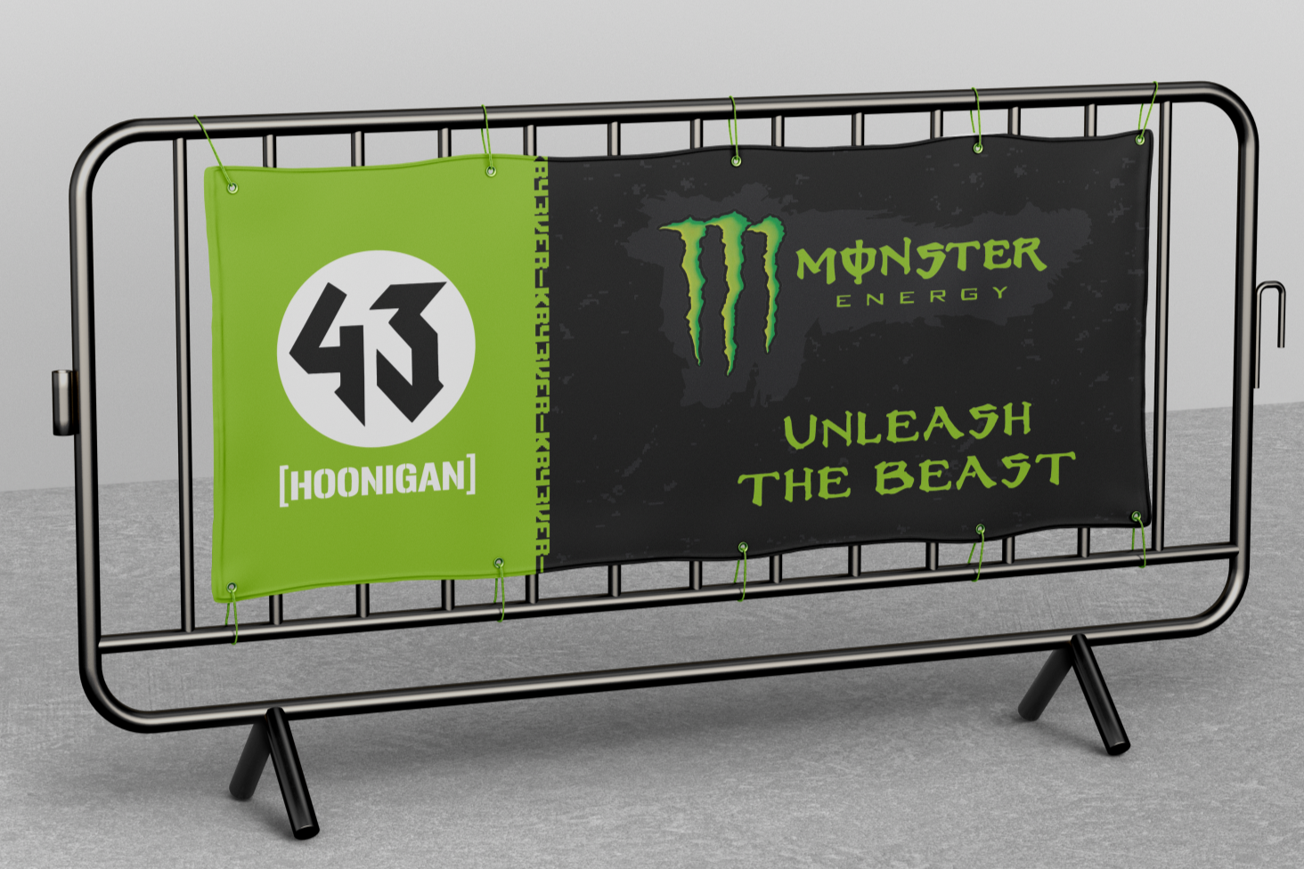
Monster Energy
X Ken Block
This is a project i did for school where we currently have to come up with our own fictitious projects for either real companies or completely made up companies
#KB43VER
-
For my last IBUZZ project i decided to do something near and dear to my heart.
As someone who loved watching Ken Block racing and drifting on custom tracks in modified cars he made himself i had to do something to honor his life, and i wanted to do it in the way of a collab. More explicitly, a rally exhibition race used to launch the competitor to Redbull’s extreme sports division.
-
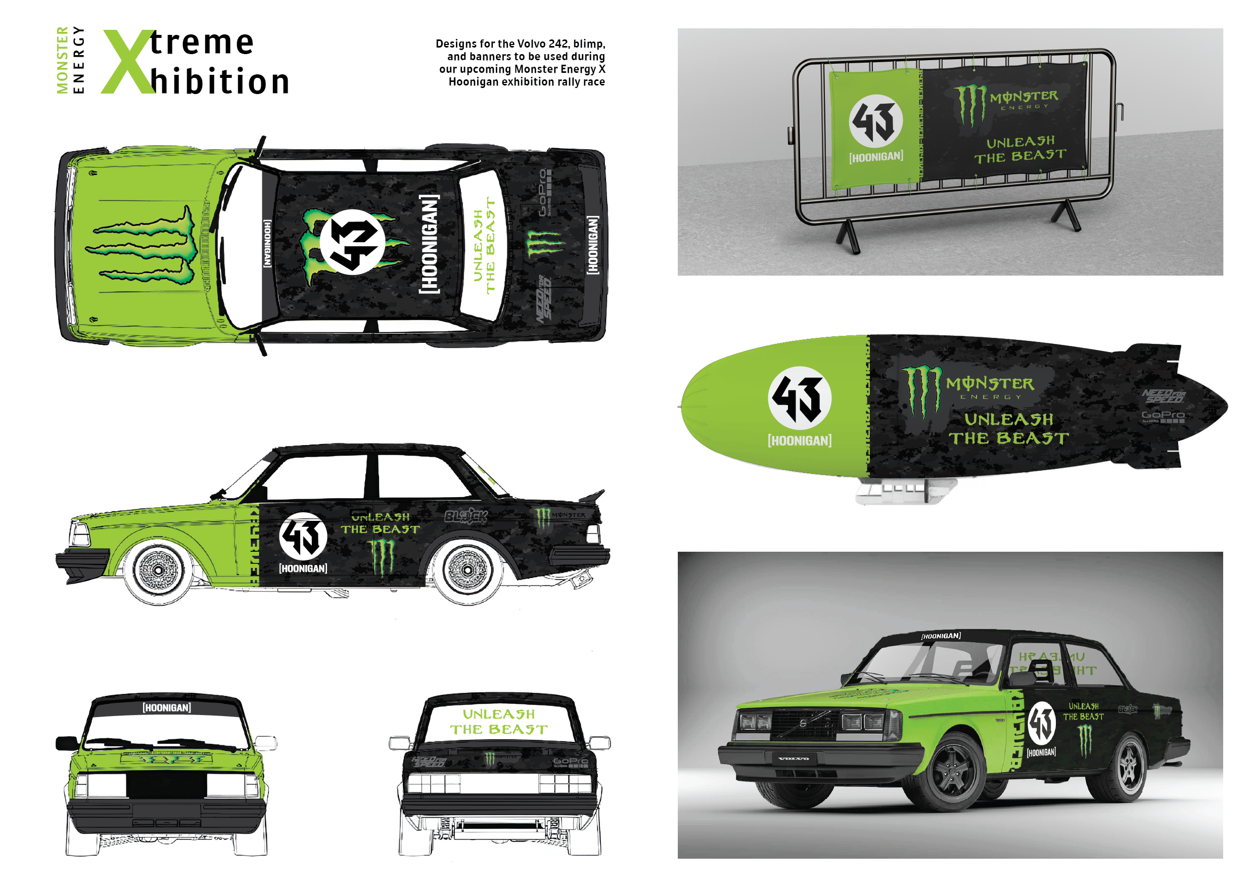
Taking major inspiration from Ken Block’s designs on the Hoonicorn, Hoonitruck, and more i knew a dark-grey and black pattern was needed to give it that KB43 feel.
Going for a digital camo pattern i mixed that with a design i saw on a fan-made design online for a Ford Focus, except instead of pure white making the blocked off area pure Monster Energy green.
Then adding decals associated with KB and the logo and slogan for Monster Energy (“Unleash the Beast”) it was ready.Designing the wrap for the car was by far the longest process because with that design done i was able to continue that design on both the blimp and the banners on the side of the racetrack
Fun Fact:
The Gameshow
This is a project i did for school where we currently have to come up with our own fictitious projects for either real companies or completely made up companies
-
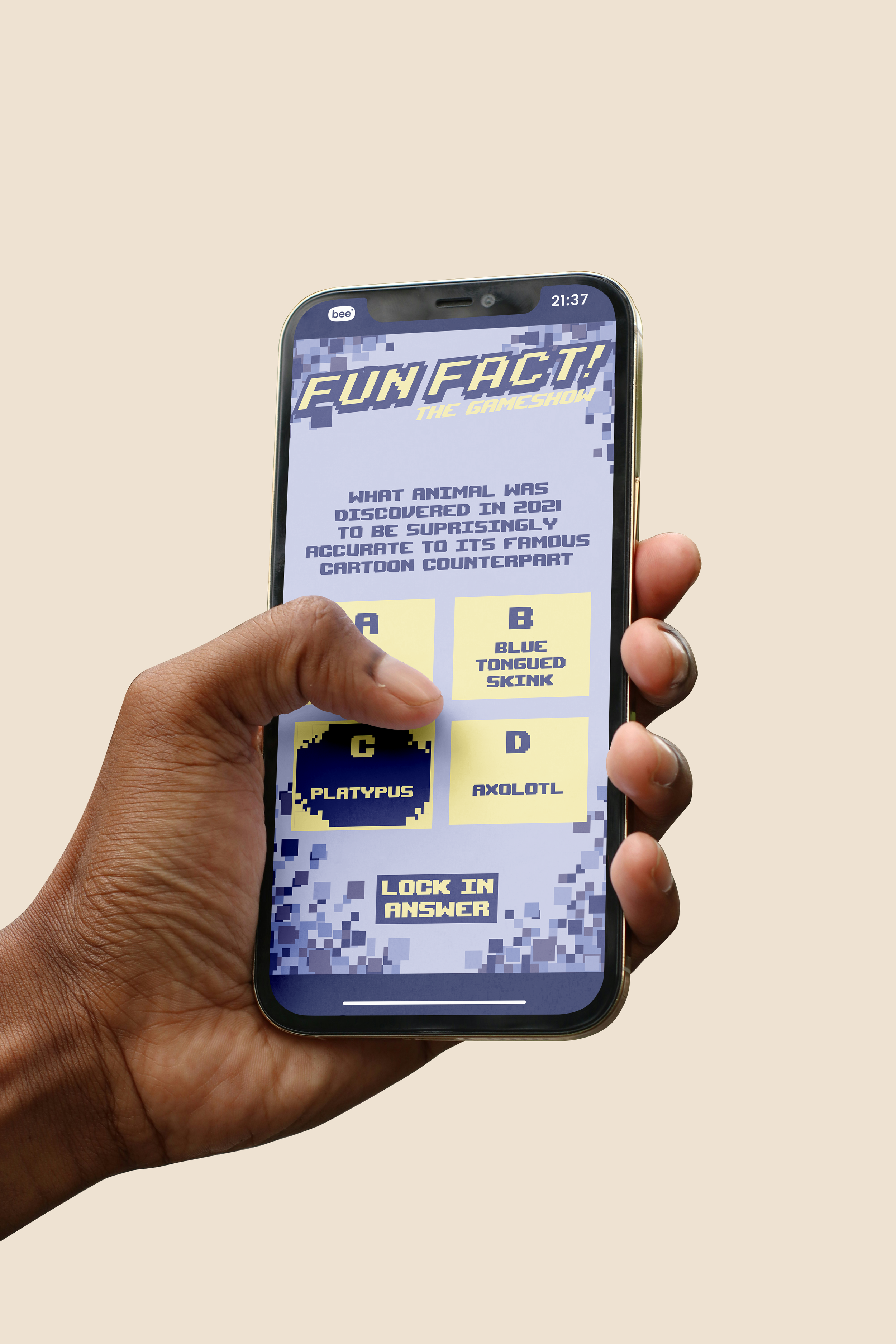
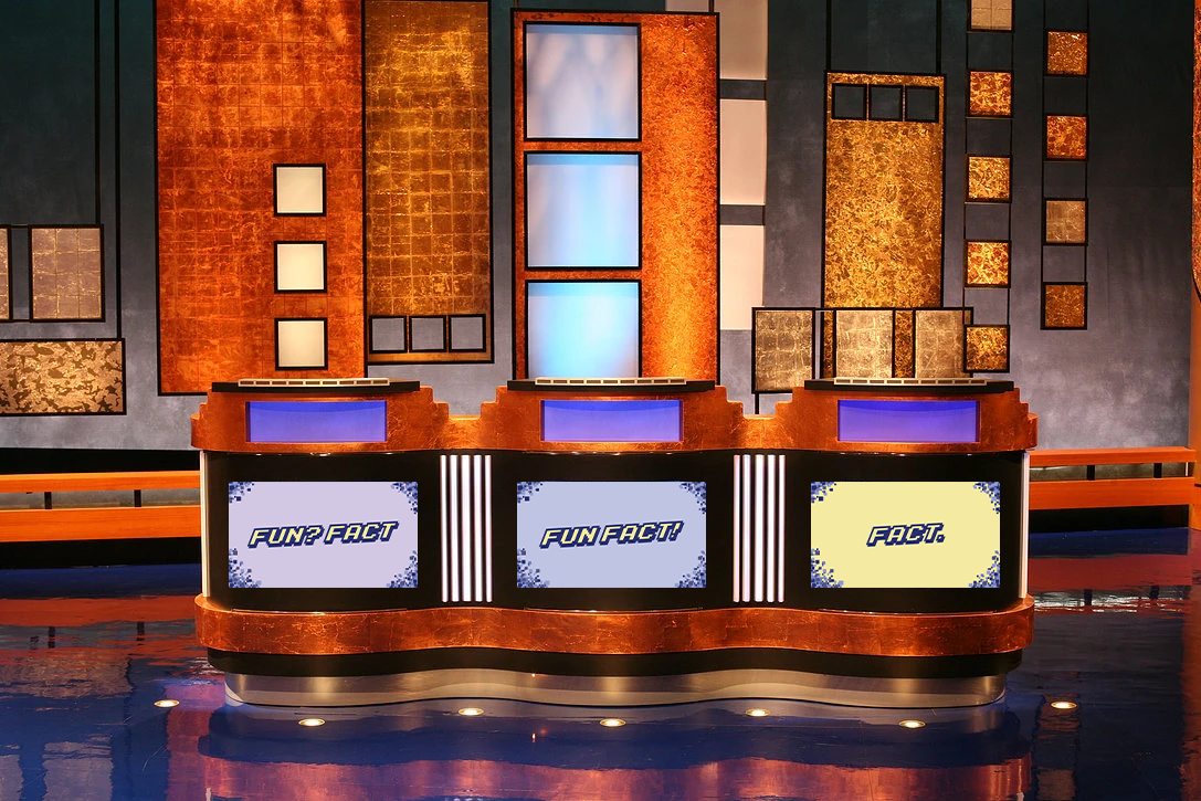
This project was making a logo, screen design, and a design for screens so people could play at home for the gameshow version of Fun Fact!
-
In the video that Doug Sharpe made announcing he was looking for designers to make something for this, i knew i had to do it for a school project.
Taking the chance to create a design in a retro style again i looked at arcade cabinet-style designs and mixing them with more modern pastel colours.
Mixing these colours with the large pixels framing the shapes and options in the mobile design come together really well
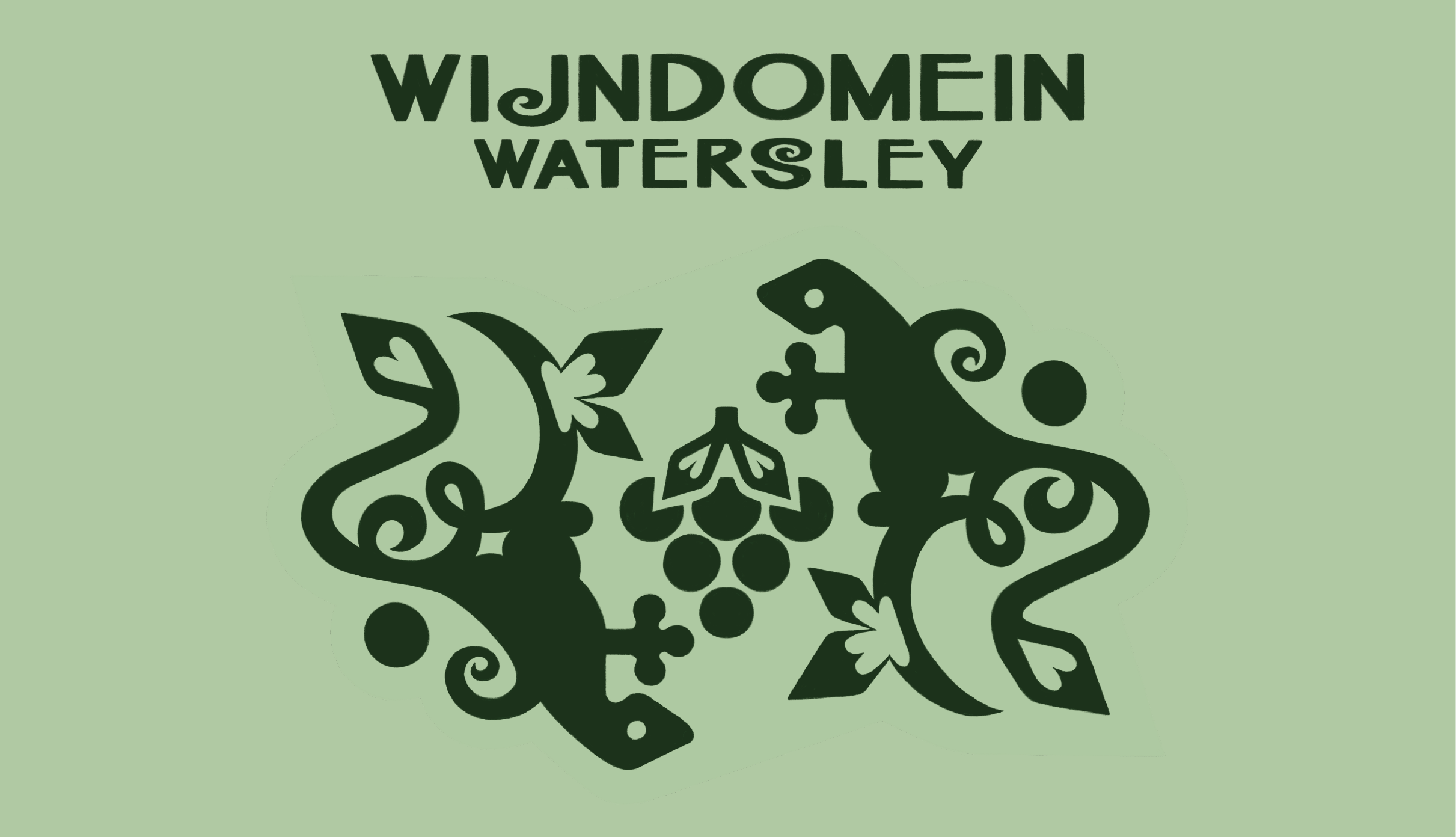
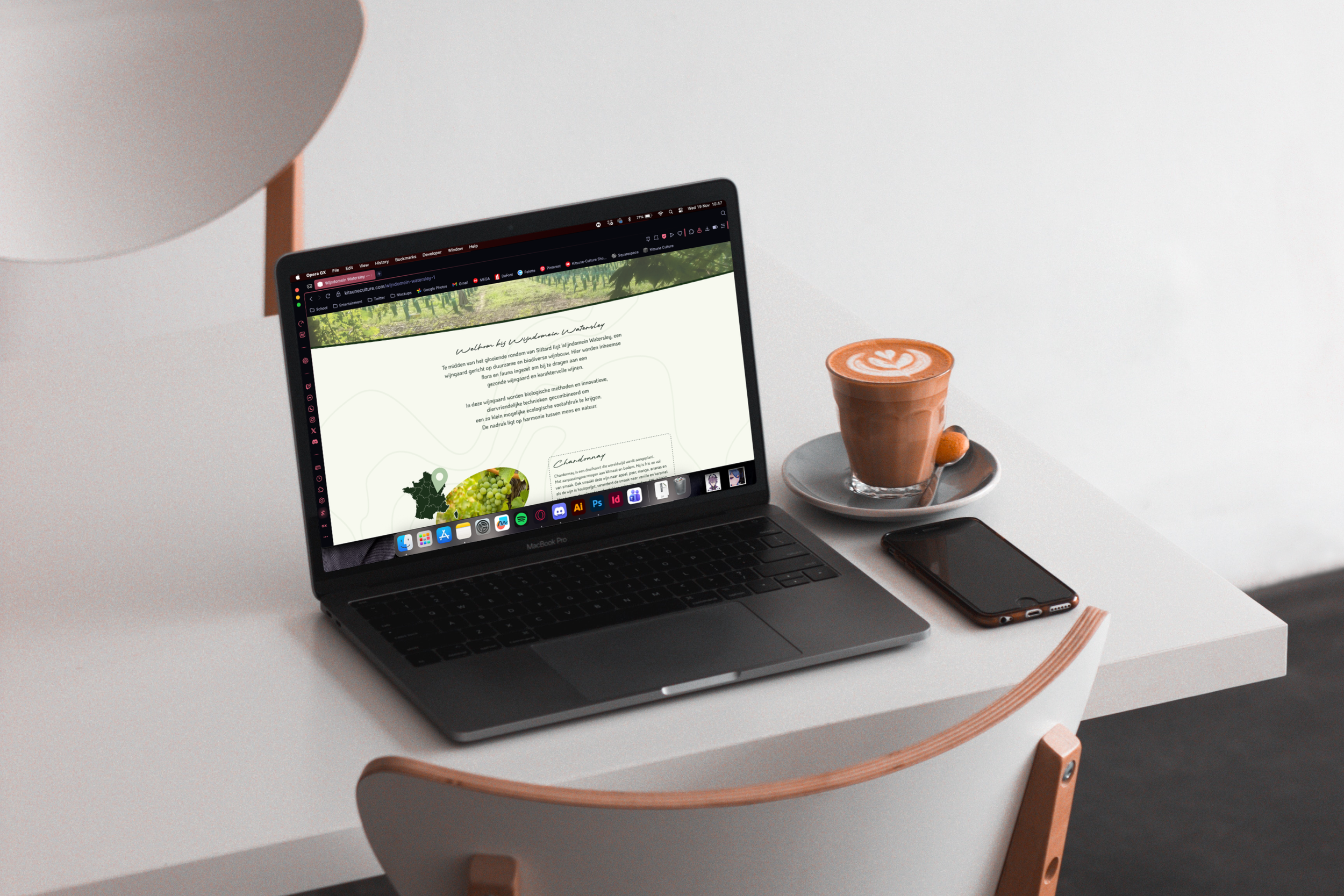
Wijndomein
Watersley
This was my final exam project that i did together with my classmate Sofie Bik (IZULUTIONS)
-
This project was our finals exam until we got our diploma (if we passed)
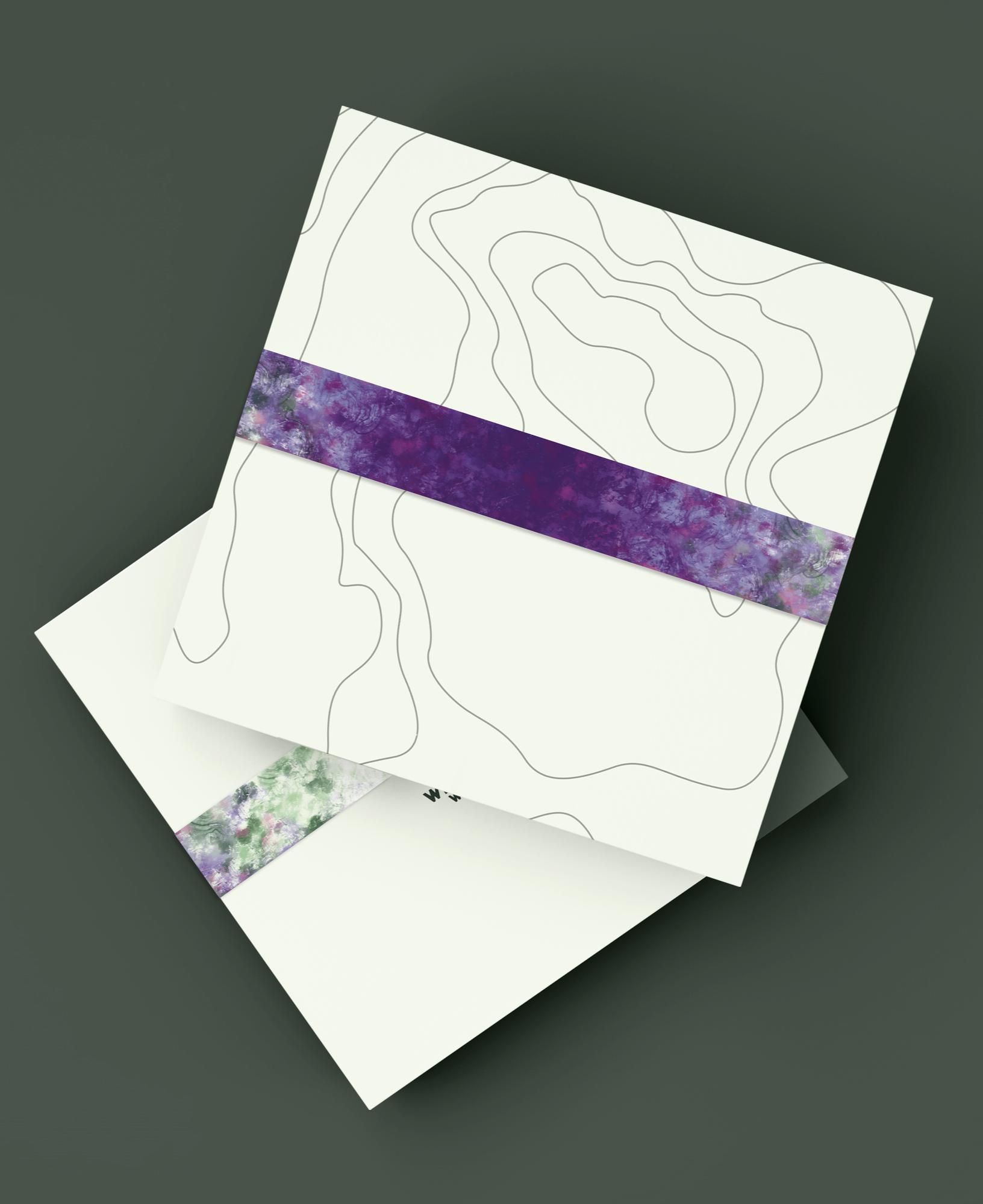
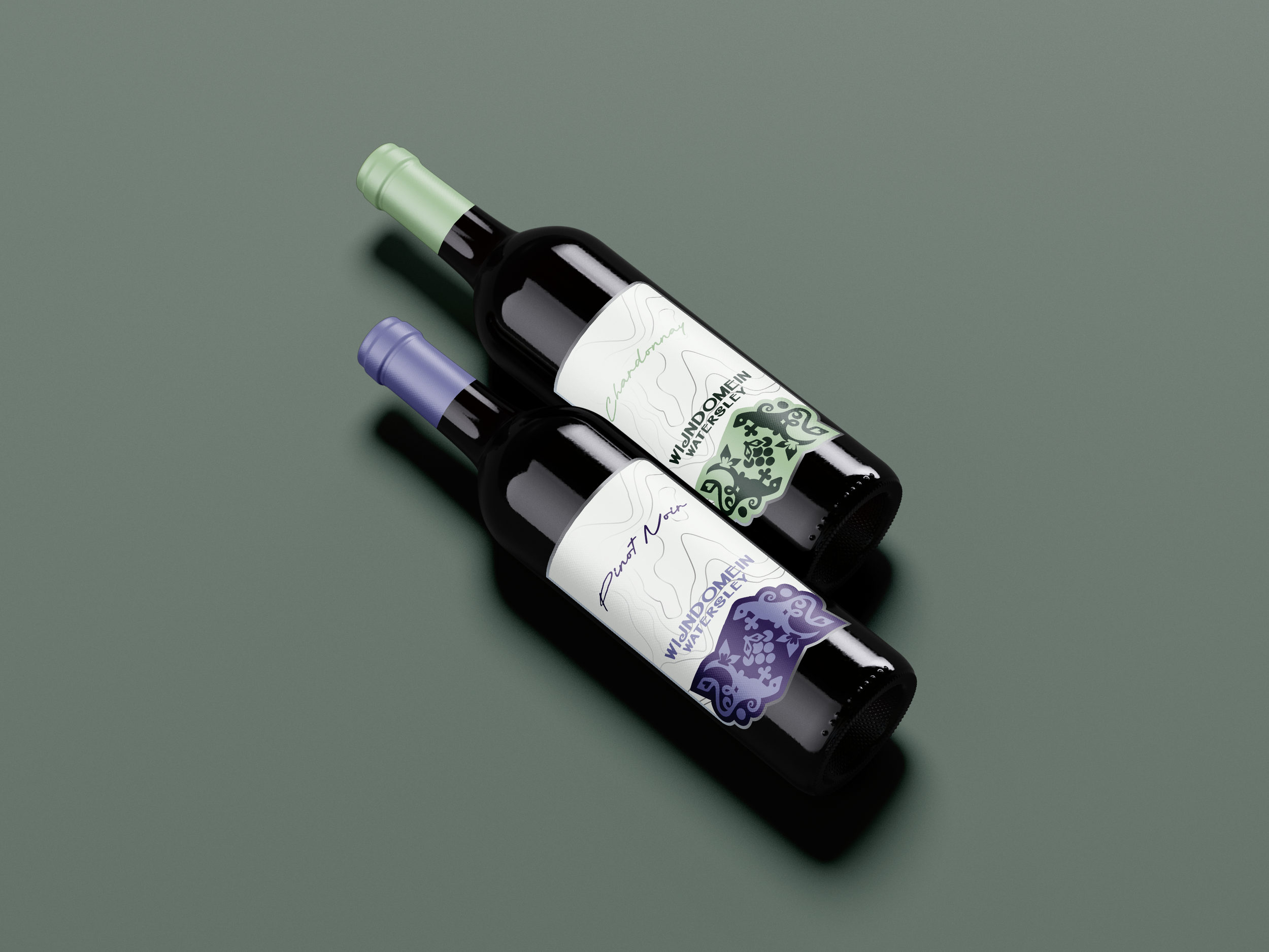
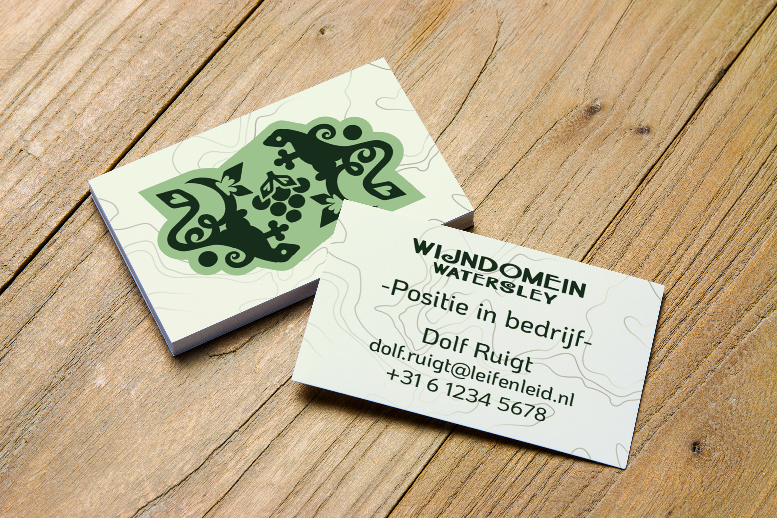
For this project we had to make a brand identity for a vineyard in Watersley, which is just outside of Sittard, called Wijndomein Watersley.
This includes a logo, colours, fonts, package designs, wine label designs, and more. -
We started out with making the logo and the colours because those really make or break a design. If your foundation is bad, then your structure collapses.
During our briefing the owner of the vineyard told us they really want to focus on the nature and education aspect more than the wine part of the business, so we decided to keep with natural, maybe slightly toned down colours and our logo prominently features a bundle of grapes and the viviparous lizards that live around the grounds.After having decided the colours and logo we needed something on the label to fill up space without just having nothing, so i came up with making a custom heightmap of Watersley and the surrounding area. This is usable everywhere from the label to the packaging to the website because its simple, tells people who recognize it that they’re local, and can blend in easy on any background.
We also decided to add a ribbon of sorts thats made to resemble an aquarelle using the colour we chose. This is a nice pop of colour for the package and also to cut off the website into the main page and footer.
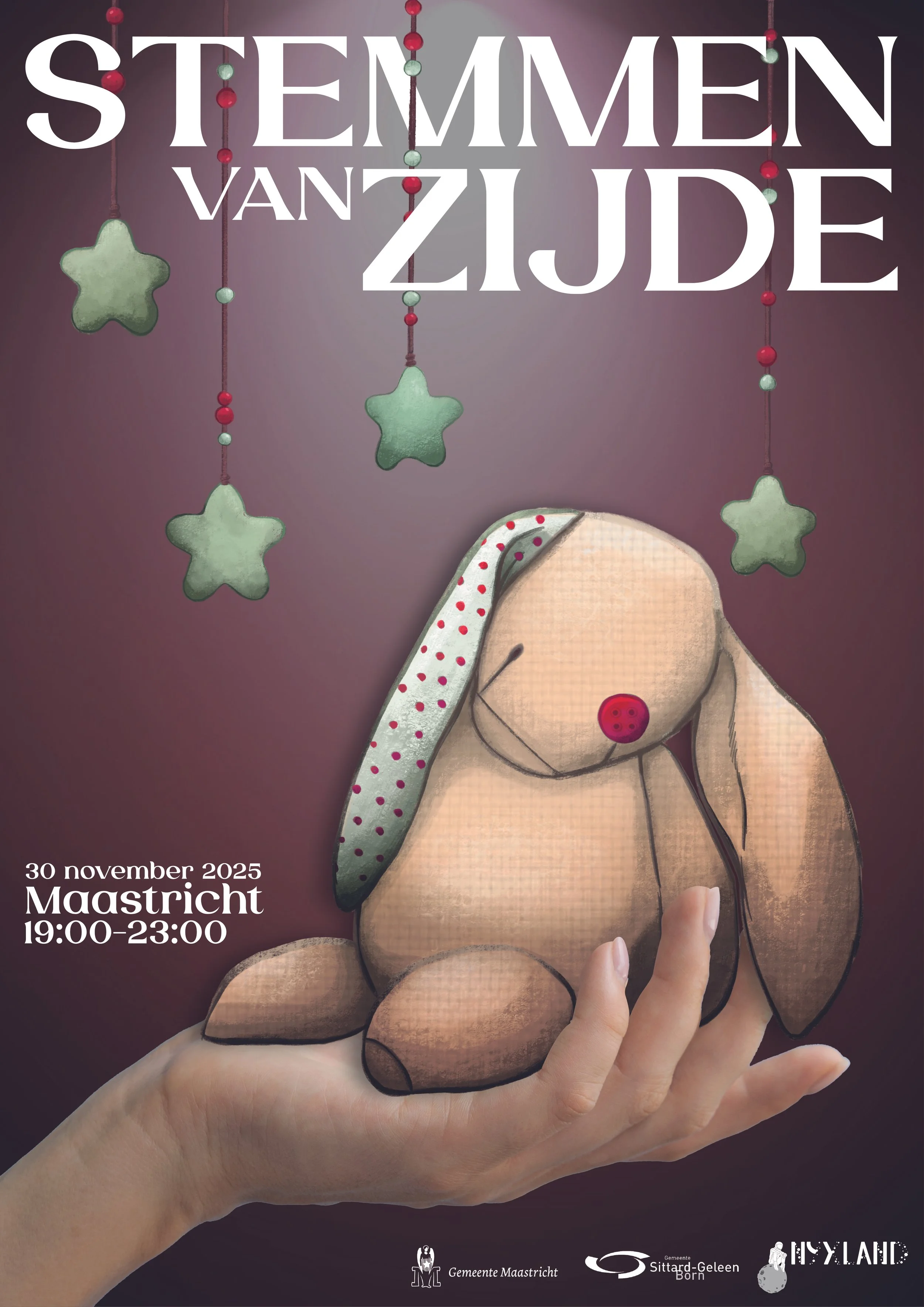
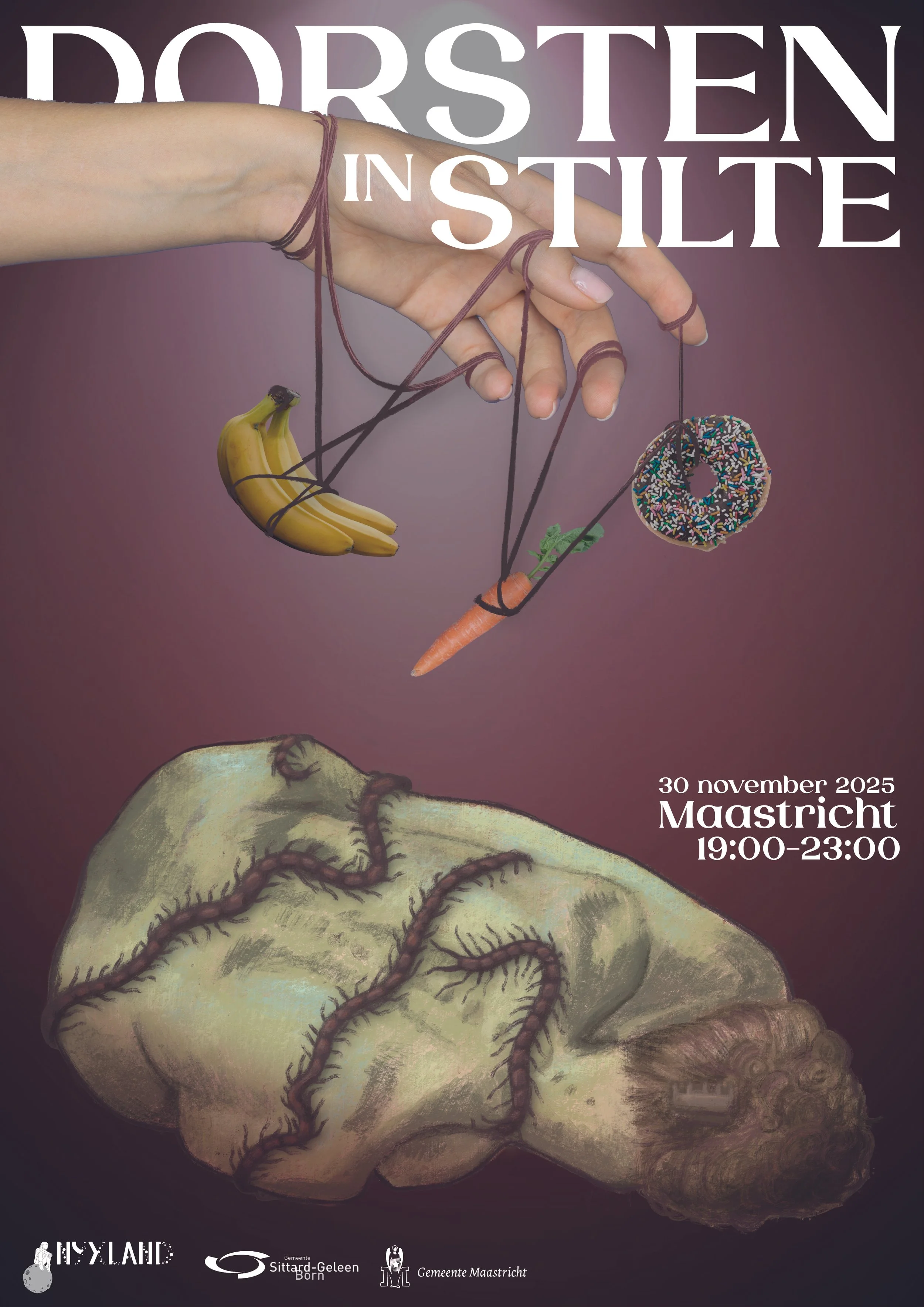
Nyxland
This was the practice for our final exam that i did together with my classmates Sofie Bik (IZULUTIONS) and Nora Aipassa (Garnet Visuals)
-
This project was practice for our final exam where we had to design posters for a theatre show
The theatre shows were about some dark subject matter but packaged in a nice enough way to show teenagers dealing with the same thing they’re not alone in that struggle.
-
We started this project with all of us making our own concepts and then picking and choosing the best elements to make one collab poster that we’re all happy with. The colours and how muted they are came from my design, the real life elements came from Nora, and the drawn elements are from Sofie.
Together with Nora we started looking for fonts that were both pretty and flowy to give the feeling that its not all doom-and-gloom while also keeping it ledgible for anyone of any age and then picking out specific elements like the hands and the foods we wanted to use on the poster while sofie made the final drawings of the plush rabbit and the woman with centipedes crawling over her.
Nora then worked on the final colour correction and addings the sponsors, location, and time and date.
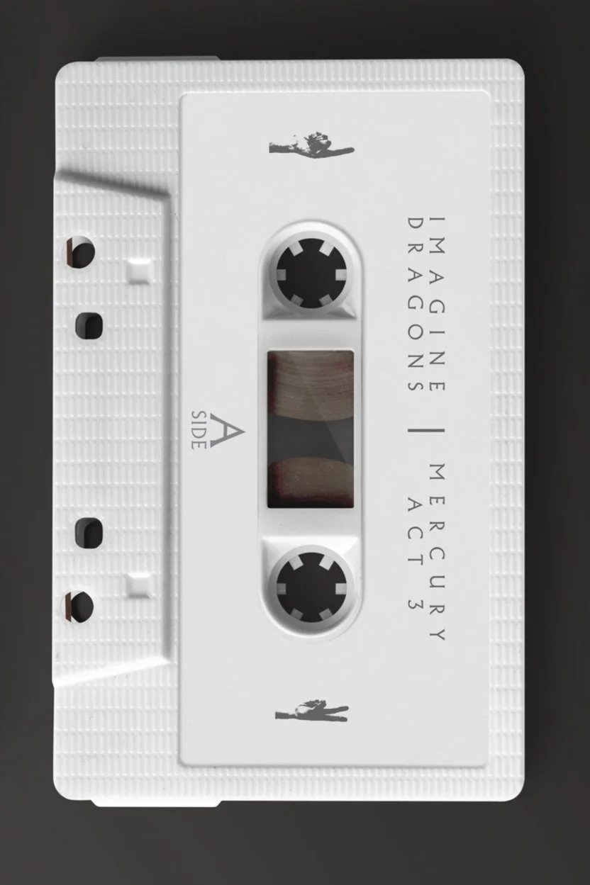
Mercury
Act III
This is a project i did for school where we currently have to come up with our own fictitious projects for either real companies or completely made up companies
-
This project was making an album cover for the “new” Imagine Dragons album: Mercury Act 3.
This is the final part of the Mercury series which deals with grief and loss
-
As a fan of Imagine Dragons i took this opportunity to reseach more about an artist and album series which has less front-forward lore than a band like my all-time favourite: twenty one pilots.
I started out by looking into the themes of both Mercury Act 1 and Act 2, and i found that these albums are about grief.
Act 1 is about the death of a loved one, and Act 2 is about recovering from that death. I decided that as a thematic fit, Act 3 should be about confronting your own mortality and life.I did my utmost best to match the style of Mercury so that it could seamlessly fit into the series.
I went for it to match closer to Act 1 than Act 2 because i felt like that would be a more accurate match, going for silver-concrete to match the worn gold and a person walking as a matching 3rd to the falling person of Act 1 and the flying one of Act 2.


Polaroid
merch
This is a project i did for school where we currently have to come up with our own fictitious projects for either real companies or completely made up companies
-
I came up with this project because i noticed that Polaroid was offering a shockingly little amount of good merchandise, and being a fan of their company and products i decided that i was gonna use my first ever self-created project to make my own little merchandise line for them
-
As per usual i started out researching for this project by searching on a mix of Pinterest, Instagram, and even a little bit of stuff on Freepik incase anything sparked some inspiration.
After getting plenty of inspiration from everything from clothing designs to old posters from the 70’s i started on designing some cool, retro designs to go on on a hat, sweatpants, and on plenty of shirts
Eventually i was done, but while watching Good Mythical Morning i saw Rhett, one of the hosts, wearing a polo shirt that inspired a whole new burst of ideas in me


Pridelaroid

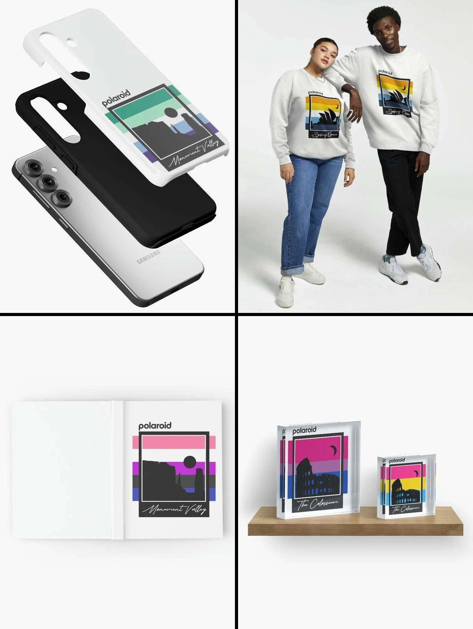

This is a follow-up project i did for the Polaroid Merch
-
After making the polaroid location shirts i came up with the idea of replacing the 5 polaroid stripes with various pride flags, allowing you to be proud while still repping Polaroid
-
The process here was relatively simple.
Just do research on some of the most well known pride flags and which ones would apply to me and my friends and then replace the stripes with the flags on every single design.As of right now the list includes: Pride, Transgender, Bisexual, Lesbian, Gay, Genderfluid, Non-Binary, AroAce, Pansexual, and Therian

Fieri’s Sizzle
Shack
This is a project i did for school where we currently have to come up with our own fictitious projects for either real companies or completely made up companies
-
This is a multi-stage project, where every stage i will update this specific section until completed
Stage 1 - Designing a logo and name for a 50’s Americana-style diner opening in New York City by “Guy Fieri”.
Stage 2 - Official, final logo and a brand book to match it and lay out the rules on how a secondary designer is and isn’t allowed to use the elements.
-
1 - As a big fan of the style and vibe of Americana, i knew doing the stylings for a diner was a must on my project to-do list.
Taking inspiration from some of the wackiest and most interesting pieces of art (i do consider them art), 1950s-1950s motel signs i created the logo on the left here, with the sharp and loud angles mixed with the love of bold text and arrows (for some reason).2 - A good brandbook is vital to any company that hires external designers, so i decided that a brand book i made should be both clear and bold like the brand itself.
Below are some of the pages that i made to give you a good feeling of the vibe that i went with.


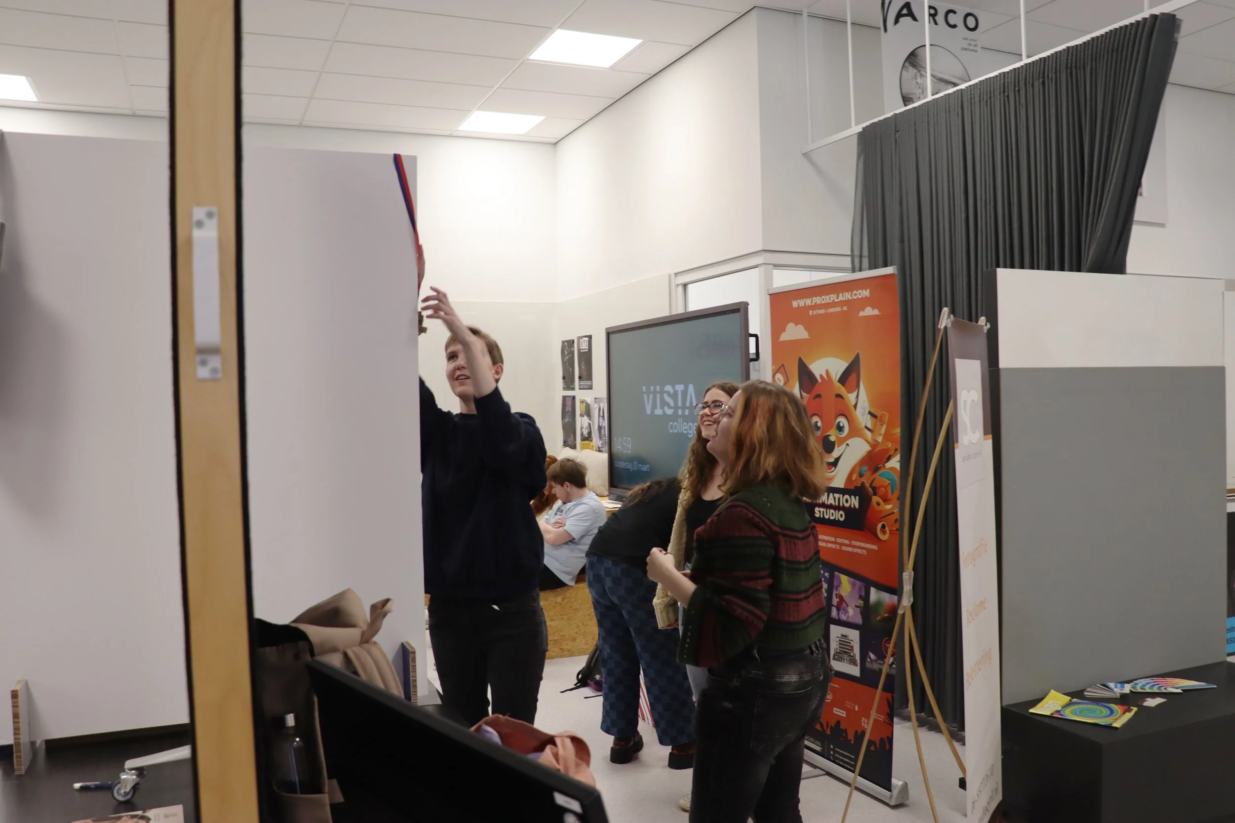
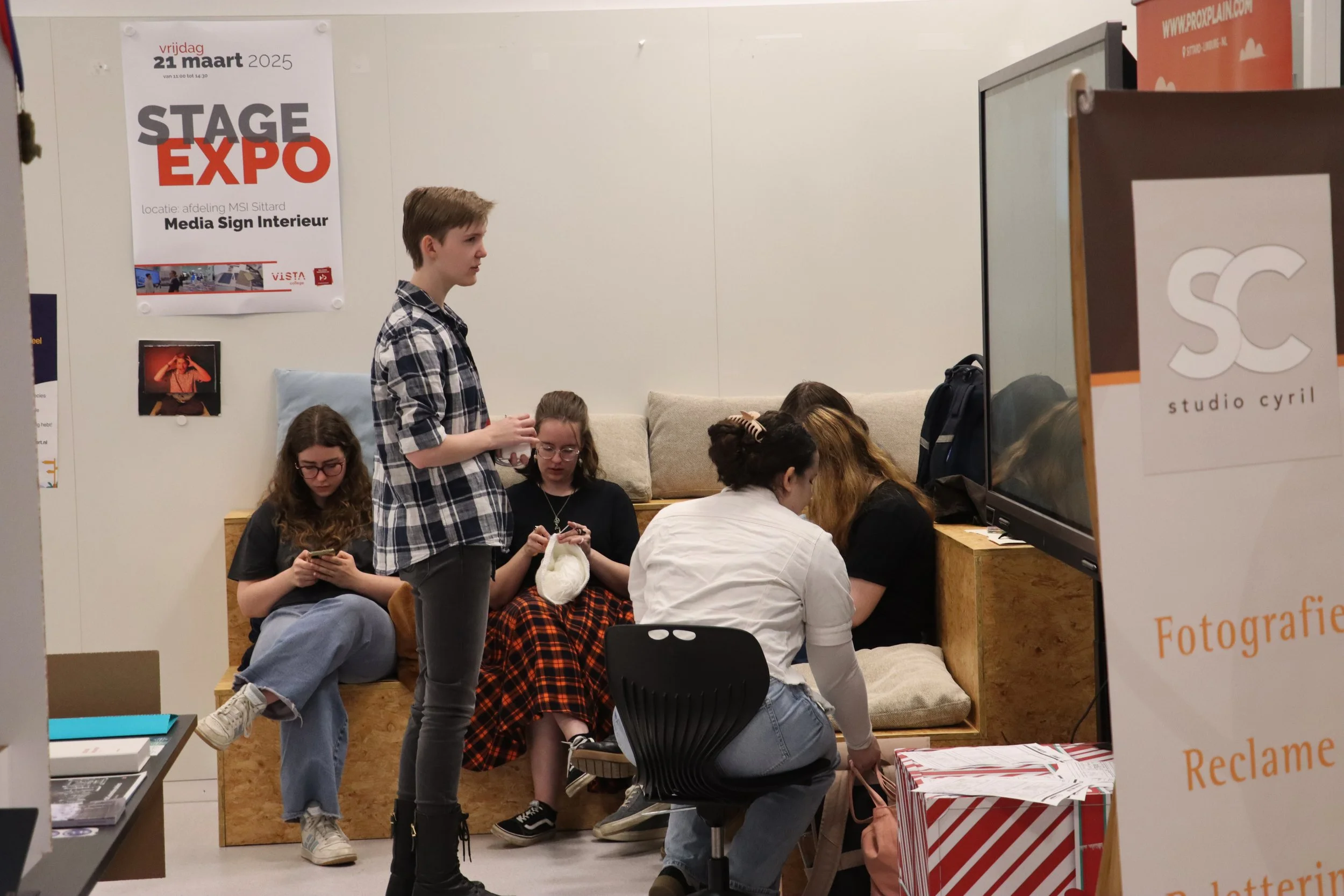
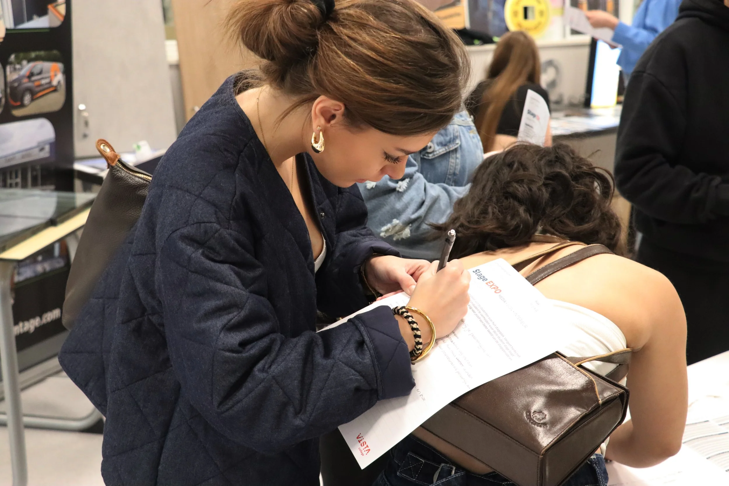
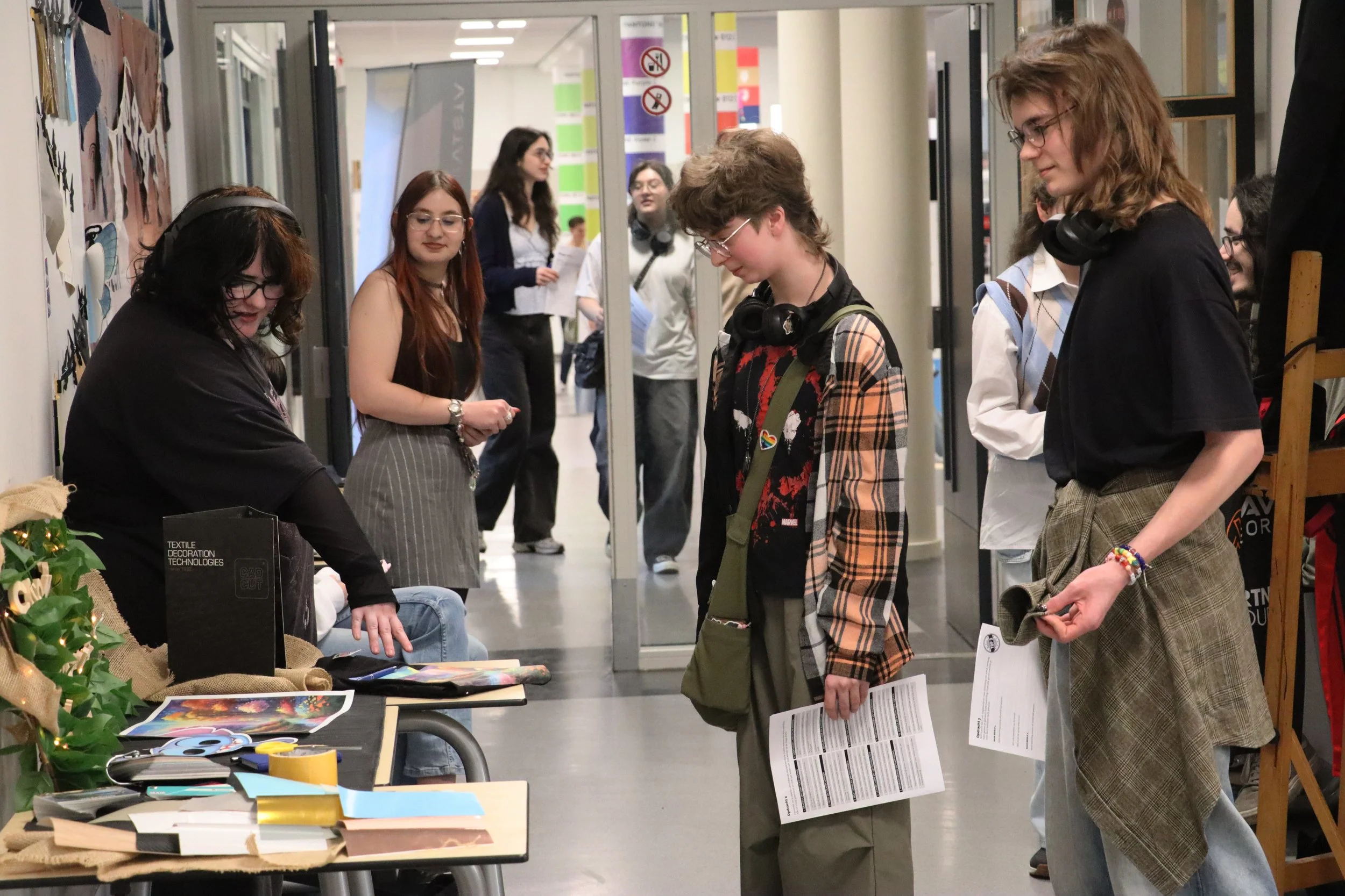
StageExpo
‘24
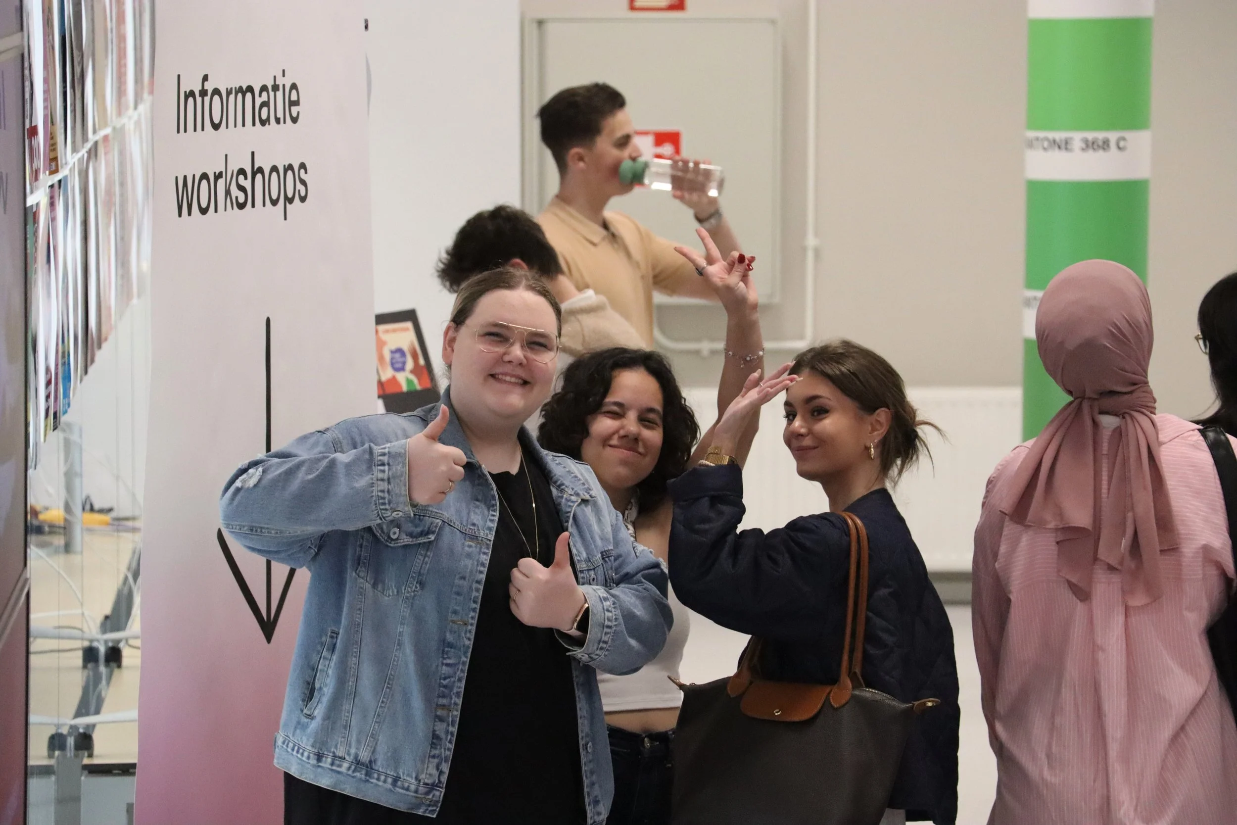
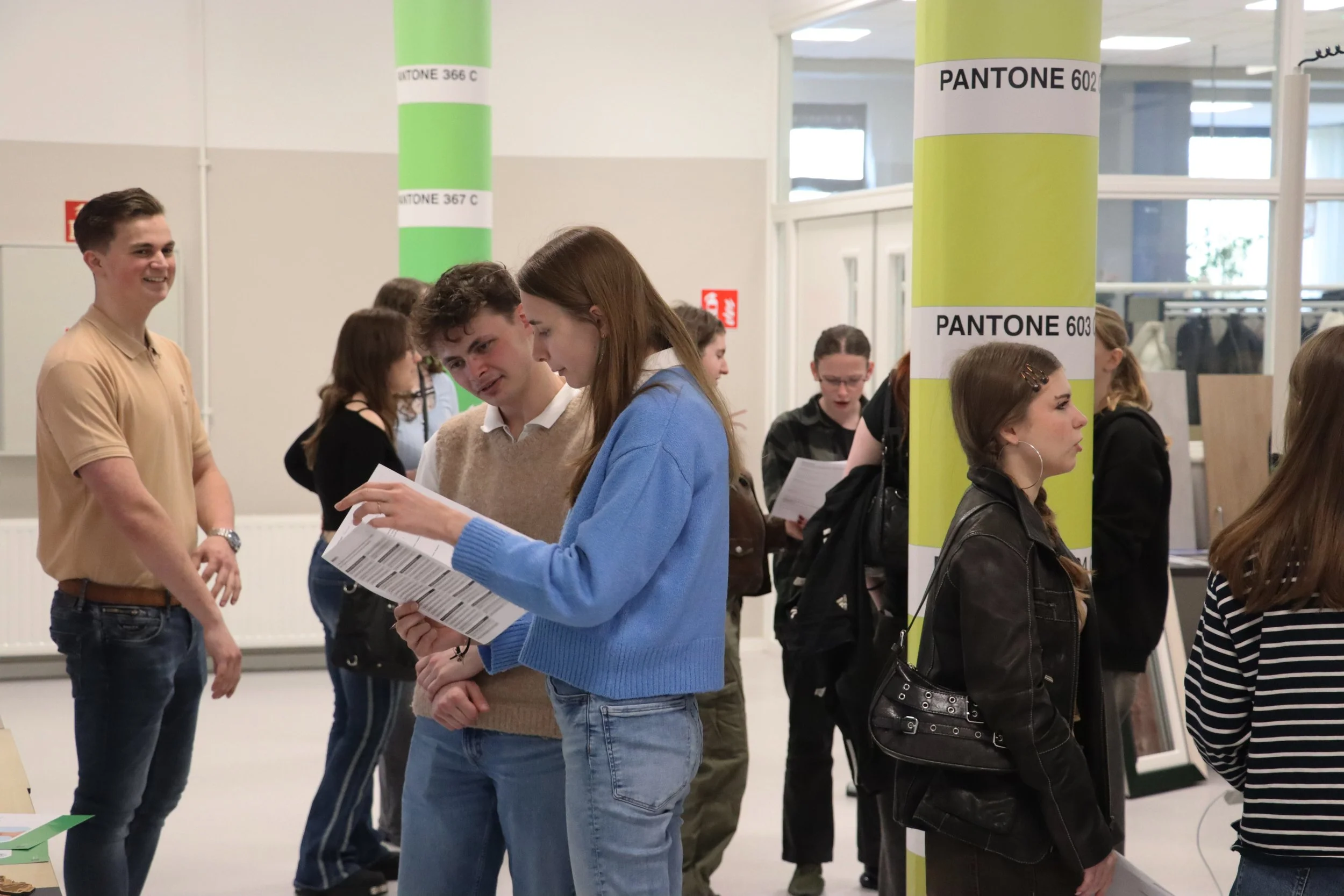
This is a project made by my school for me and a few classmates to be the photographers for one of the (yearly) events they had

Urpop
poster
This is a project where an actual company came to our school to give the students a real project. Depending on the project you can view it on the businesses website/socials
-
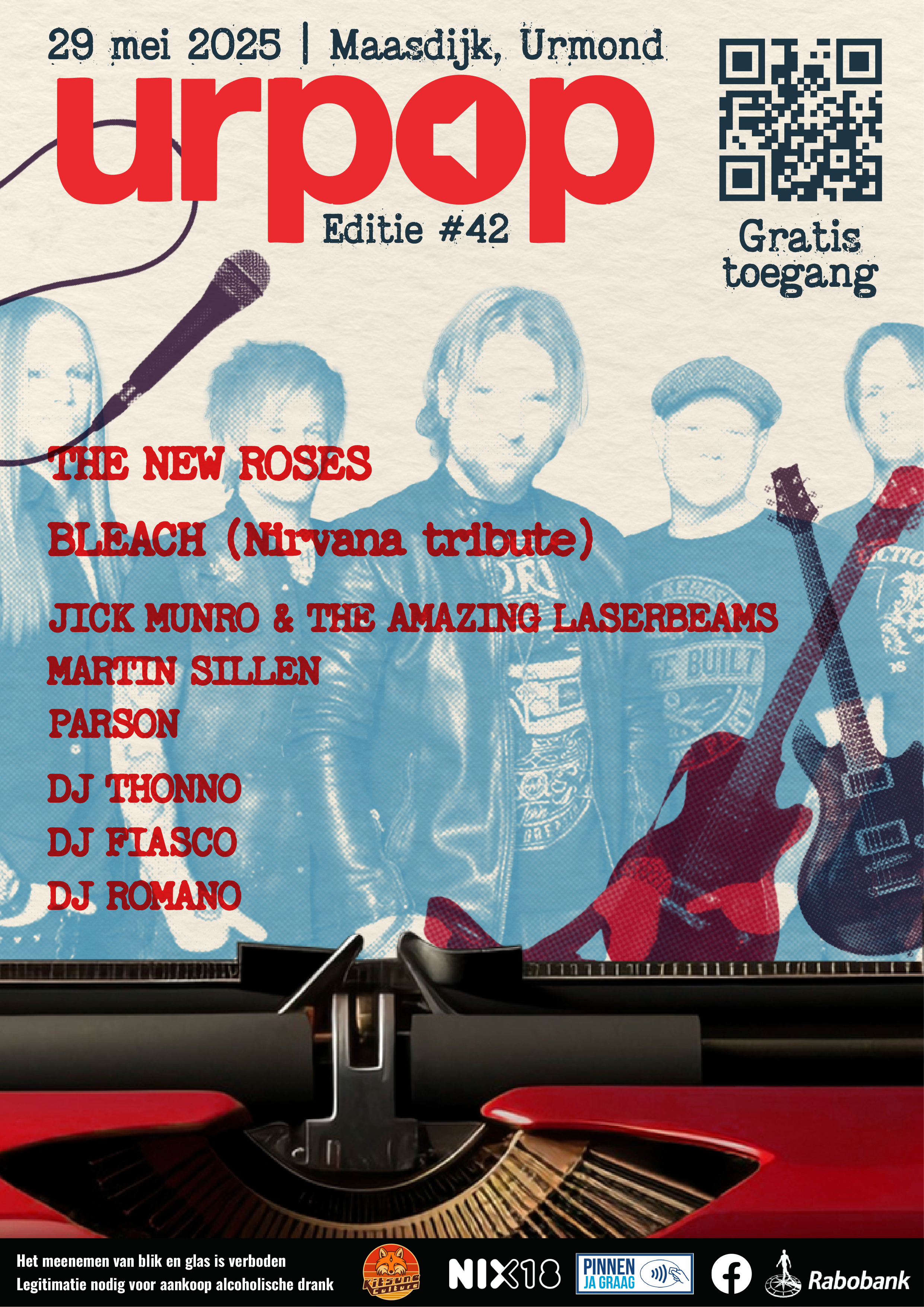
This project was making a poster for Urpop, a yearly free festival held in Urmond, Limburg
They’ve been coming to our school for almost a decade now to let the students make our own poster for their event, and the winner gets to be the official poster for that year
-
I started out researching both general festival posters all over the world, and posters for similar events in specifically The Netherlands and the general Benelux area and Germany
One of my teachers told me that it’d be interesting to make something that they had never chosen before, so i chose certain styles and elements that i hadn’t seen anywhere and colours i saw rarely or just not at all on my searches

Music artist
spread
This is a project i did for school where we got hand-picked projects from our teachers, so we shared these completely with everyone in class, barring some exceptions where we got to pick specifics
-
I came up with this project because i noticed that Polaroid was offering a shockingly little amount of good merchandise, and being a fan of their company and products i decided that i was gonna use my first ever self-created project to make my own little merchandise line for them
-
As per usual i started out researching for this project by searching on a mix of Pinterest, Instagram, and even a little bit of stuff on Freepik incase anything sparked some inspiration.
After getting plenty of inspiration from everything from clothing designs to old posters from the 70’s i started on designing some cool, retro designs to go on on a hat, sweatpants, and on plenty of shirts
Eventually i was done, but while watching Good Mythical Morning i saw Rhett, one of the hosts, wearing a polo shirt that inspired a whole new burst of ideas in me

Advertisements
This is a project i did for school where we got hand-picked projects from our teachers, so we shared these completely with everyone in class, barring some exceptions where we got to pick specifics
-
This project was making a poster for Urpop, a yearly free festival held in Urmond, Limburg
They’ve been coming to our school for almost a decade now to let the students make our own poster for their event, and the winner gets to be the official poster for that year
-
I started out researching both general festival posters all over the world, and posters for similar events in specifically The Netherlands and the general Benelux area and Germany
One of my teachers told me that it’d be interesting to make something that they had never chosen before, so i chose certain styles and elements that i hadn’t seen anywhere and colours i saw rarely or just not at all on my searches

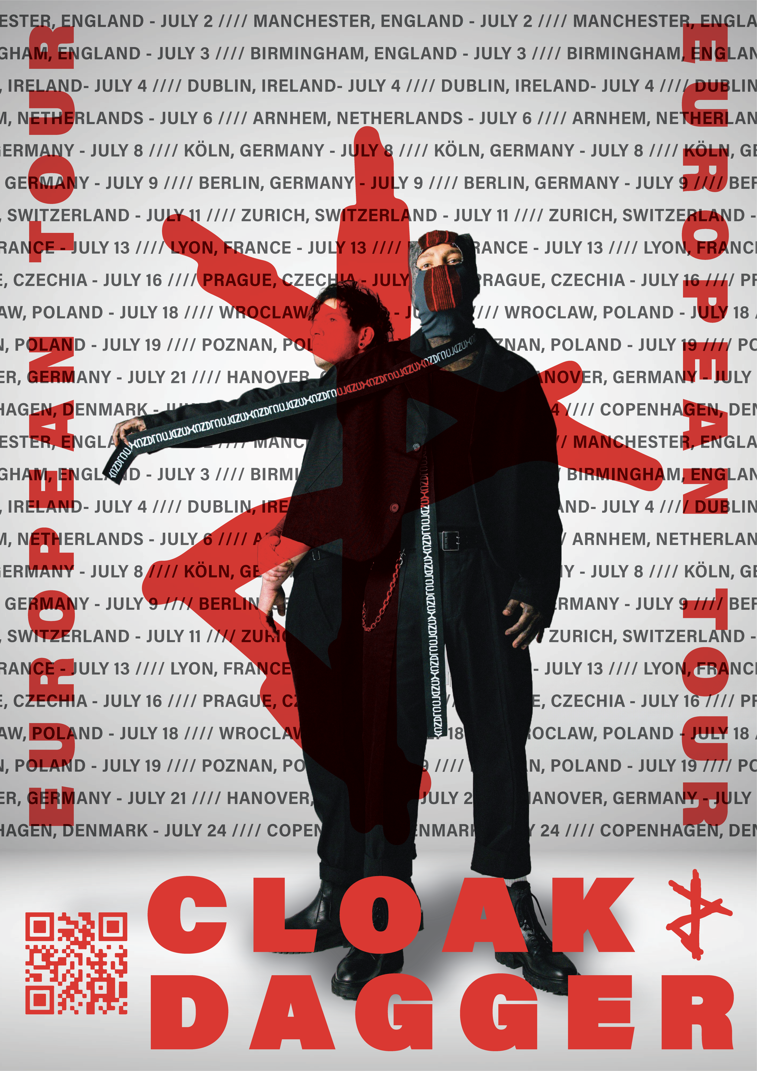
Artist
Poster
This is a project i did for school where we got hand-picked projects from our teachers, so we shared these completely with everyone in class, barring some exceptions where we got to pick specifics
-
I came up with this project because i noticed that Polaroid was offering a shockingly little amount of good merchandise, and being a fan of their company and products i decided that i was gonna use my first ever self-created project to make my own little merchandise line for them
-
As per usual i started out researching for this project by searching on a mix of Pinterest, Instagram, and even a little bit of stuff on Freepik incase anything sparked some inspiration.
After getting plenty of inspiration from everything from clothing designs to old posters from the 70’s i started on designing some cool, retro designs to go on on a hat, sweatpants, and on plenty of shirts
Eventually i was done, but while watching Good Mythical Morning i saw Rhett, one of the hosts, wearing a polo shirt that inspired a whole new burst of ideas in me